A website can look professional and still feel generic. The layout works, the colors match, and everything fits on the screen, but nothing about it feels specific to the business.
That is the gap we are closing with Claude Code. Not just getting a website onto a page, but giving it a clear design direction, distinctive imagery, thoughtful motion, and the finishing touches that make it feel custom.
For this build, I’m creating a single-page website for a Seattle steakhouse called Cascade & Coal. The workflow covers setup, two free design skills, a strong brief, custom hero imagery, several polish passes, and deployment at a real domain. You do not need to write the code yourself, but you do need to direct the result.
The $10,000 target is a design standard, not a guaranteed valuation. The point is to aim for the level of care you would expect from an expensive custom website, without starting from a template.
What You'll Learn
- Use eight design pillars to judge quality instead of stopping at a good-looking first draft.
- Combine design skills, visual references, and clarifying questions to establish a distinctive website direction.
- Refine imagery, subtle interactions, copy, typography, and mobile layouts through deliberate polish passes.
- Deploy the static website with its homepage at the top level of the uploaded ZIP.
Table of Contents
- 1. Define What a $10,000 Website Actually Means
- 2. Set Up Claude Code in the Desktop App
- 3. Install Two Free Design Skills
- 4. Give Claude a Brief, Not Just a Request
- 5. Judge the First Version Against the Checklist
- 6. Create Imagery That Belongs to the Brand
- 7. Polish the Site Until It Feels Custom
- 8. Publish the Website at Your Own Domain
- The Difference Is in the Direction and the Final Pass
1. Define What a $10,000 Website Actually Means
Claude Code is an AI coding assistant. You describe what you want in natural language, and it creates and edits the project files for you. We’re using the desktop app because it keeps the conversation and coding workflow together without requiring a separate editor setup.
Unlike a template-first workflow, Claude Code can build a site around your brief from scratch. That gives you room for a more distinctive result. But custom code alone does not make a website good. You need a standard to judge it against.
Here are the eight pillars I use:
- Point of view: The site has a recognizable direction, rather than a collection of fashionable elements.
- Typography: Fonts, sizing, spacing, and contrast feel deliberately chosen.
- Color: A restrained palette supports the brand instead of competing for attention.
- Hierarchy: The page makes it obvious what to read first, second, and third.
- Imagery: Photos, graphics, and video belong to the visual identity.
- Motion: Movement adds character and guides attention without becoming distracting.
- Mobile: The phone experience feels designed, not merely squeezed into a smaller viewport.
- Invisible quality: The site feels fast, functional, and finished.
These sit under three bigger ideas: taste, substance, and felt quality. You need all three. A beautiful hero cannot carry a weak mobile layout, and elaborate animation cannot rescue a site with no clear identity.
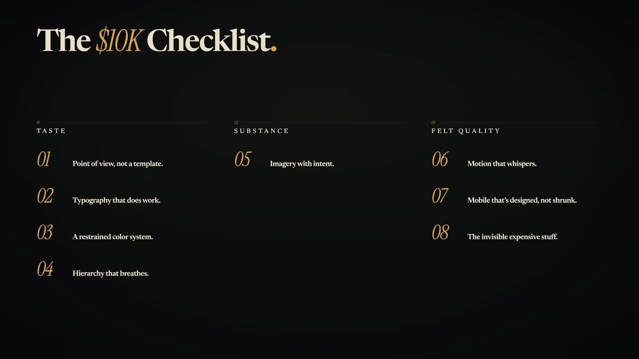
You can also keep the free $10K Website Checklist PDF alongside your project. We’ll return to it once the first version is working.
2. Set Up Claude Code in the Desktop App
Start at Claude and choose a plan that includes the coding workflow. For this build, I used Pro, which was $20 per month at the time of recording. Check the current pricing and included access before signing up.
- Sign in and use the download option to find the desktop app.
- Download the appropriate installer for your computer and install it.
- Open the app and sign in.
- Switch from Chat to Code mode.
- Create a dedicated folder on your computer for the website.
- Use the folder selector near the message box to open that folder as your project workspace.
In the version I used, Code mode was in the upper-left corner. The keyboard shortcut was Command + 3 on Mac or Control + 3 on Windows.
Claude’s interface changes regularly, so your buttons may not be in exactly the same places. The important concept is simple: switch into the coding workspace and give Claude a dedicated project folder. That is where your website files and assets will live.
3. Install Two Free Design Skills
Out of the box, Claude is a general-purpose assistant. Its default website output can lean on familiar fonts, predictable layouts, and the same visual patterns that show up across AI-generated sites.
A skill gives Claude a more specialized set of instructions. For this workflow, we’re adding two: one to improve its general design decisions, and another to guide the main design process.
Frontend Design by Anthropic
The first is Anthropic’s Frontend Design skill. It encourages stronger visual direction and pushes against overused choices that make a website look generic.
Copy the skill’s link into Claude Code and ask it to install the skill. Approve the requested installation edits and choose a global installation when prompted.
This is the background layer of the workflow. It gives Claude design guidance without requiring you to specify every font choice or layout decision yourself.
UI UX Pro Max
The second is the community-built UI UX Pro Max skill. The version shown included 57 UI styles, 95 color palettes, and 56 font pairings.
Paste its link into Claude Code with this instruction:
Install this plugin using npm.
That wording matters for the installation approach used here. Approve the relevant edits and install it globally when asked.
We’ll call this skill directly for the initial design brief, rather than relying only on background guidance.
Choose the Working Mode
For this build, I switched the mode selector beneath the message box to Auto. This lets Claude work with fewer permission interruptions. Understand the permissions you are granting before enabling it, and keep this work inside the dedicated project folder.
4. Give Claude a Brief, Not Just a Request
The quality of the brief has a huge effect on the quality of the site. “Build me a restaurant website” leaves almost every meaningful decision open. A specific direction gives Claude something to work toward.
If you already know the look you want, describe it. If you struggle to put visual taste into words, use references.
Collect Three to Five Visual References
These are useful places to find direction:
- Dribbble for designer portfolios, interface concepts, and a wide range of visual styles.
- Awwwards for high-quality, award-recognized website design.
- Pinterest for broader searches around your business type and preferred aesthetic.
For a restaurant, a search such as “modern restaurant website design” is a practical starting point. Save screenshots of three to five sites you like and attach them to your brief.
The goal is to communicate taste, not copy another business. References help Claude understand the typography, spacing, mood, and visual treatment you are aiming for. They also help you figure out your own preferences before committing to a direction.
Ask for Clarifying Questions Before the Build
Start the brief by invoking /UI-UX-Pro-Max, as shown in this workflow. Then describe the business and the kind of site you need.
For our example, that means a Seattle restaurant website with a premium steakhouse identity. The most important instruction comes at the end: ask Claude to clarify the brief before building anything.
In my project, Claude came back with seven areas to resolve:
- The restaurant name.
- The visual style.
- The page sections.
- Who would provide the written content.
- The technology stack.
- The animation level.
- Any additional requirements.
It also proposed three design directions: a dark Manhattan steakhouse, Pacific Northwest modern, and a traditional chop house.
I chose dark, moody luxury with Pacific Northwest grounding. That last part matters. I wanted the richness of a premium steakhouse without making a Seattle restaurant feel as though it belonged in Manhattan.
The scope was deliberately tight: five sections, one continuous scrolling page, no gallery, and no integrated booking system.
This is where it pays to slow down. Your answers establish the site’s identity and architecture. The more clearly you resolve those questions now, the less time you spend undoing assumptions later.
5. Judge the First Version Against the Checklist
In this build, Claude spent roughly three minutes planning before writing code, followed by another four or five minutes building. Treat those as an example, not a fixed schedule.
The first version was already a strong starting point. But “that looks good” is not a useful stopping rule. We need to understand why it works and what is still missing.
Point of View
The site had a coherent identity because the brief established one. Dark surfaces, editorial typography, and restrained accents all supported the same restaurant concept.
Typography
Claude chose Fraunces for the headlines and Inter for the body text. The headline treatment suited the direction, but I wanted a less familiar body font. That became a later polish task.
Color
The palette stayed within five main tones: near black, warm cream, oxblood, brass, and slate.
That restraint matters. A premium restaurant site does not need every section to introduce another color. Repetition makes the visual identity feel intentional.
Hierarchy
In the location section, the neighborhood and city were large, the address was smaller, and the supporting details were smaller again. The sizing gave the eye a clear reading order.
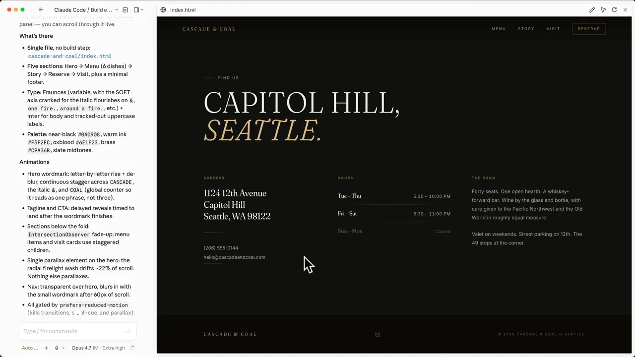
The menu copy also had useful specificity: a 16-ounce dry-aged ribeye, aged for 60 days and cooked over the hearth. Concrete details create a stronger impression than a paragraph of generic luxury language.
At this stage, the direction, color, and hierarchy were working. Imagery, motion, mobile, and the finishing layer still needed attention.
6. Create Imagery That Belongs to the Brand
Imagery is one part of the process Claude cannot fully solve through page code alone. You need to bring in suitable assets.
The strongest option is custom photography or graphics made for the business. If you have those, place them in your project folder and tell Claude which files to use and where they belong.
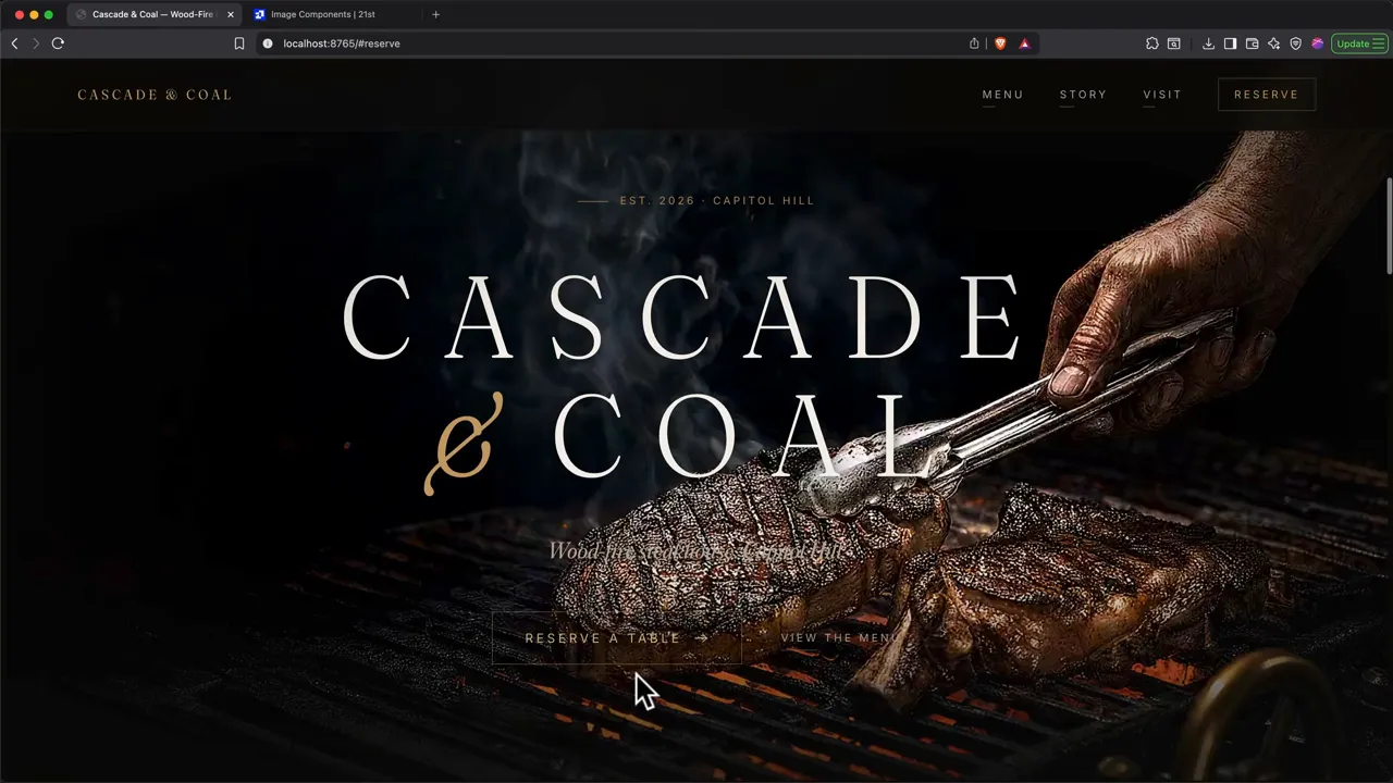
If custom production is outside the budget, AI-generated imagery can help you develop a visual direction. For this steakhouse, I used an image-to-video workflow to create the hero asset.
The Hero Asset Workflow
- Ask Claude to write the image prompt. It already knows the restaurant’s mood, palette, and design direction.
- Generate a still image. In this build, I used OpenAI’s image model through ElevenLabs and selected one of four results.
- Animate the chosen image. I used that same image as the starting frame for Google Veo 3.1.
- Upscale the result. I used Topaz within the same interface.
- Add the finished asset to the project folder. Then tell Claude how to integrate it.
The useful shortcut is having Claude write the generation prompt. You do not have to explain the brand again to a separate tool from scratch.
I used ElevenLabs to access the image, video, and upscaling tools in one place. The offer promoted with this build was 50% off the first month of the Creator plan; check the current terms and model availability before purchasing.
Use Premade Components for Visual Direction
For effects that are not photography or video, 21st.dev is a useful library of components, animations, buttons, and scroll treatments.
You can browse it for ideas or copy a component’s integration prompt into Claude Code. For this project, I found a smooth-scroll image treatment, copied its prompt, and asked Claude to apply that direction to the steak video in the hero.
Then Claude pushed back, which was useful.
The component used React, while our website was a simple static HTML project. Bringing it in unchanged would have introduced a different architecture just to achieve one visual effect. Claude instead recreated the behavior within the existing setup.
Borrow the effect without automatically adopting its entire technical stack. A dashboard, account system, or more interactive application may justify a framework. This single-page restaurant site did not need one simply for its hero.
Expect to Debug the Effect
The first attempt displayed the video but did not connect it properly to scrolling. I explained the difference between what was happening and what I expected.
Claude fixed two bugs, but the page still did not behave correctly. I asked it to investigate further. With browser inspection, it found the deeper problem and got the scroll-driven hero working.
That is the pattern to use when an effect breaks:
- Describe what currently happens.
- Explain what should happen instead.
- Ask Claude to inspect the behavior rather than simply trying another guess.
- Test the result again.
After the interaction worked, we made another pass for readable text over the brighter imagery and refined how the hero content appeared during scrolling.
7. Polish the Site Until It Feels Custom
Once the structure and hero are working, step back. This is the point where adding random effects becomes tempting. Instead, return to the original checklist.
Ask for an Honest Audit
Paste the eight criteria into Claude and ask it to assess the current site against each one, identifying strengths, partial successes, and gaps.
For this project, point of view, color, and hierarchy were strong. Typography was mixed, as were imagery, motion, mobile, and invisible quality.
That is useful feedback. You do not need an encouraging score. You need to know what remains unfinished.
Request a Cohesive Batch of Improvements
For the first polish pass, lead with intent rather than prescribing a long list of effects. I asked for more handcrafted micro-interactions and explained that the lower sections needed to feel more refined, not busier.
Claude proposed a coordinated set of changes:
- A subtle film-grain layer across the site.
- Animated brass hairlines between sections.
- An ember glow behind the reservation section.
- Word-by-word headline reveals.
- Additional small finishing details.
Review the proposed batch before approving it. Grouping related changes reduces back-and-forth and gives Claude a better chance of making them feel like one design system rather than unrelated decorations.
Then Review Every Section Yourself
The batch is not the final pass. Scroll through the site section by section and identify anything that still feels flat.
This part needs your judgment. Claude can assess structure and suggest effects, but you still decide whether the experience feels right.
For each weak section, ask for one restrained interaction.
In the reservation section, the ember glow looked good but felt static. I asked for fire-like movement that responded to the cursor. Claude added parallax to the embers, making the section feel more alive.
In the story section, I asked for elegant micro-movement. Claude added a candlelit halo that followed the cursor. The first version was too obvious, so I asked for a softer, more refined treatment. The revised halo trailed gently behind the cursor instead of sticking to it.
That is the rule: add just enough movement to give the section character, then reduce it until it stops demanding attention.
Make the Copy More Restrained
AI-generated copy often explains too much, stacks adjectives, and tries too hard to sound impressive. Premium copy usually benefits from the opposite approach.
The menu heading in this build worked because it compressed the concept into a short line about six dishes sharing one fire. The dish descriptions then supplied the concrete details.
Use that division of labor: short headlines establish the idea, while supporting copy adds information. The Frontend Design skill helped steer this project toward that more restrained style.
Revisit Default Font Choices
Inter is a capable font, but it appears so frequently in AI-generated designs that I wanted something different here. Claude replaced it with Geist.
The lesson is not that one font is always wrong and another is always right. It is that the typography should be a deliberate choice, not a default you forgot to question.
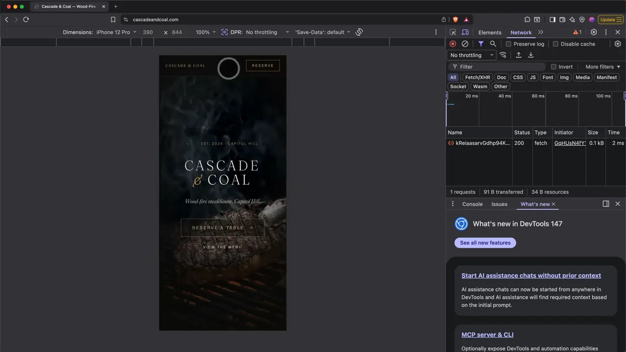
Design the Mobile Version Separately
Responsive is not the same as designed for phones. A layout can technically fit on a small screen and still have awkward spacing, oversized branding, or controls that feel out of proportion.
Ask Claude for a dedicated mobile pass. Have it consider:
- Which elements should be hidden on smaller screens.
- Which spaces should become tighter.
- Which type and interface elements should resize.
- How the navigation should change.
For Cascade & Coal, that meant collapsing the navigation, tightening the wordmark spacing, and introducing a smaller button variant.
Before moving on, revisit all eight pillars. Do not let visible polish become a substitute for checking whether the site actually feels functional and finished.
8. Publish the Website at Your Own Domain
Until now, the website only exists on your computer. A preview address beginning with localhost is local to your machine. Sending that address to someone else will not give them access to your site.
To make it public, you need hosting and a domain. Hosting makes the files available on a server; the domain gives people an address they can use.
I used Hostinger for this deployment. Some links in this guide are affiliate links, which means we may earn a commission at no extra cost to you.
Choose Hosting Based on the Actual Project
For our static restaurant website, the Premium plan used in this walkthrough covered the requirements. There was no login, checkout flow, or database.
For a project with a backend, user accounts, payments, or a Node.js setup, the walkthrough pointed to Business instead. Check the current plan specifications against what Claude actually built before purchasing. The architecture and required runtime matter more than how elaborate the page looks.
A visually rich static site can still have simple hosting needs. Conversely, a modest-looking application may require a more advanced setup.
Register the Domain and Complete Checkout
- Open Hostinger and select the appropriate hosting plan.
- Choose your term. In the offer shown, 12 months was the minimum for a free first-year domain.
- Search for your preferred domain and claim it if available.
- Create your account and complete the billing steps.
My example total was about $43 for the first year of hosting, a domain, and the included email offer. Adding one $20 month of Claude Pro put the basic build and hosting example at roughly $60. That did not include optional paid asset-generation tools, and it is not a fixed quote. Promotions, renewal prices, and included services can change.
Prepare the ZIP File Correctly
During onboarding, the options used were Migrate existing site, followed by Upload backup files. Then select the domain you registered.
Now open the project folder on your computer. For this static build, the deployable files include index.html and the images, video, and asset subfolders it uses.
Compress the files inside the project folder, not the outer folder itself.
This detail is easy to miss. If you compress the outer folder, the extracted website can end up one directory too deep. The domain may not find the homepage where it expects it.
- Open the folder containing the finished website.
- Select its website files and asset folders using Command + A on Mac or Control + A on Windows.
- Right-click the selection.
- On Mac, choose Compress. On Windows, use the option to create a compressed ZIP folder.
- Check that index.html is at the top level of the ZIP, alongside the required assets, rather than inside another project folder.
- Move the ZIP outside the project folder if needed and give it a recognizable name.
This upload method applies to the static site we built here. A project with a backend or build process needs the deployment approach appropriate to that architecture.
Upload and Open the Live Site
Drag the ZIP into the upload area, wait for it to finish, click Next, and submit the request. Once the deployment completes, open your domain to check the public site.
The Hostinger offer promoted with this workflow was an additional 10% off its current promotional pricing. Check the available price and terms when you sign up.
The Difference Is in the Direction and the Final Pass
The initial generation gets you a starting point. The brief gives that starting point an identity. Brand-specific imagery makes it feel less interchangeable. The audit shows you where it is unfinished.
Then the small decisions do the rest: a quieter cursor effect, a better body font, tighter mobile spacing, clearer text over the hero, and copy that says more with fewer words.
That is how you move beyond a generic AI website. Give Claude a clear direction, judge the result against a real standard, and keep refining until the site feels intentional from the first screen to the last.
Made with VideoToBlog using Build $10,000 Websites using Claude Code (Ultimate Guide)


